Pagination
Color
| Element | Property | Color token |
|---|---|---|
| Container | background-color | $layer * |
| border-top | $border-subtle * | |
| Text: items per page | text color | $text-primary |
| Text: number of items | text color | $text-secondary |
| Icon | fill | $icon-primary |
* Denotes a contextual color token that will change values based on the layer it is placed on.
Typography
Pagination text should be set in sentence case with the first letter of each word capitalized.
| Element | Font-size (px/rem) | Font-weight | Type token |
|---|---|---|---|
| Text | 14 / 0.875 | Regular / 400 | $body-compact-01 |
Structure
The Pagination bar is most commonly used in data tables. The width can vary depending on content and layout, but should span the entire width of the table it’s being paired with.
| Element | Property | px / rem | Spacing token |
|---|---|---|---|
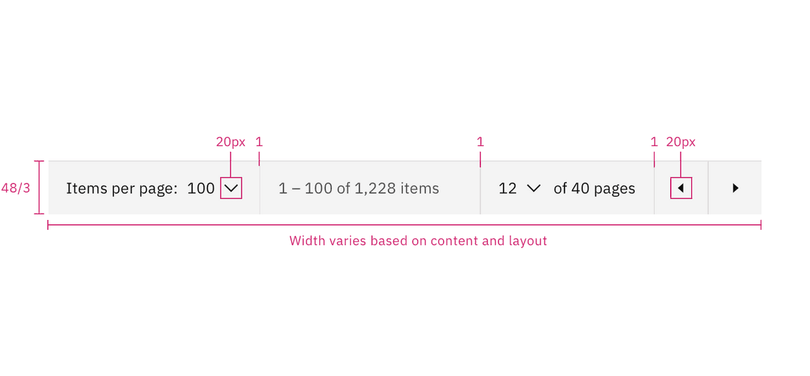
| Container | border | 1px | – |
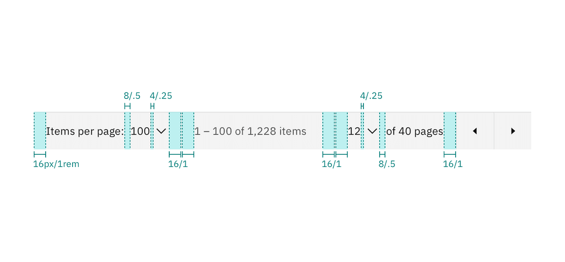
| padding-left, padding-right | 16 / 1 | $spacing-05 | |
| Select control | padding-left, padding-right | 16 / 1 | $spacing-05 |
| Arrow icon | size | 20 x 20px | – |

Spacing measurements for pagination | px / rem

Structure measurements for pagination | px / rem
Sizes
| Element | Size | Height (px/rem) |
|---|---|---|
| Container height | Small (sm) | 32 / 2 |
| Medium (md) | 40 / 2.5 | |
| Large (lg) | 48 / 3 | |
| Icon button | Small (sm) | 32 / 2 |
| Medium (md) | 40 / 2.5 | |
| Large (lg) | 48 / 3 |